Unlocked Magazine
Ideated and designed a magazine about creativity during lockdown representing the IDEO London community.
①
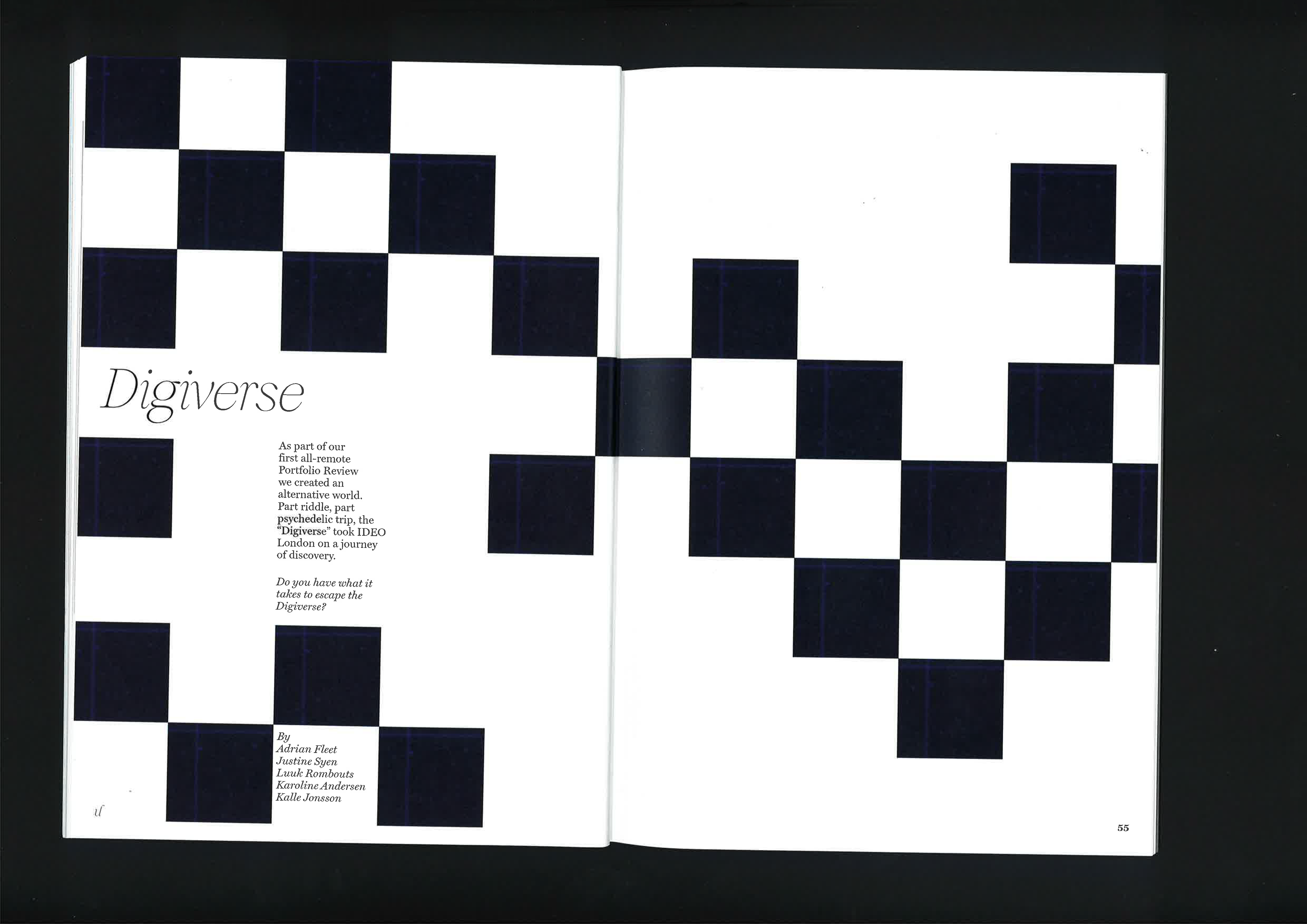
THE BRIEFUnlocked Magazine: Lockdown Creativity at IDEO
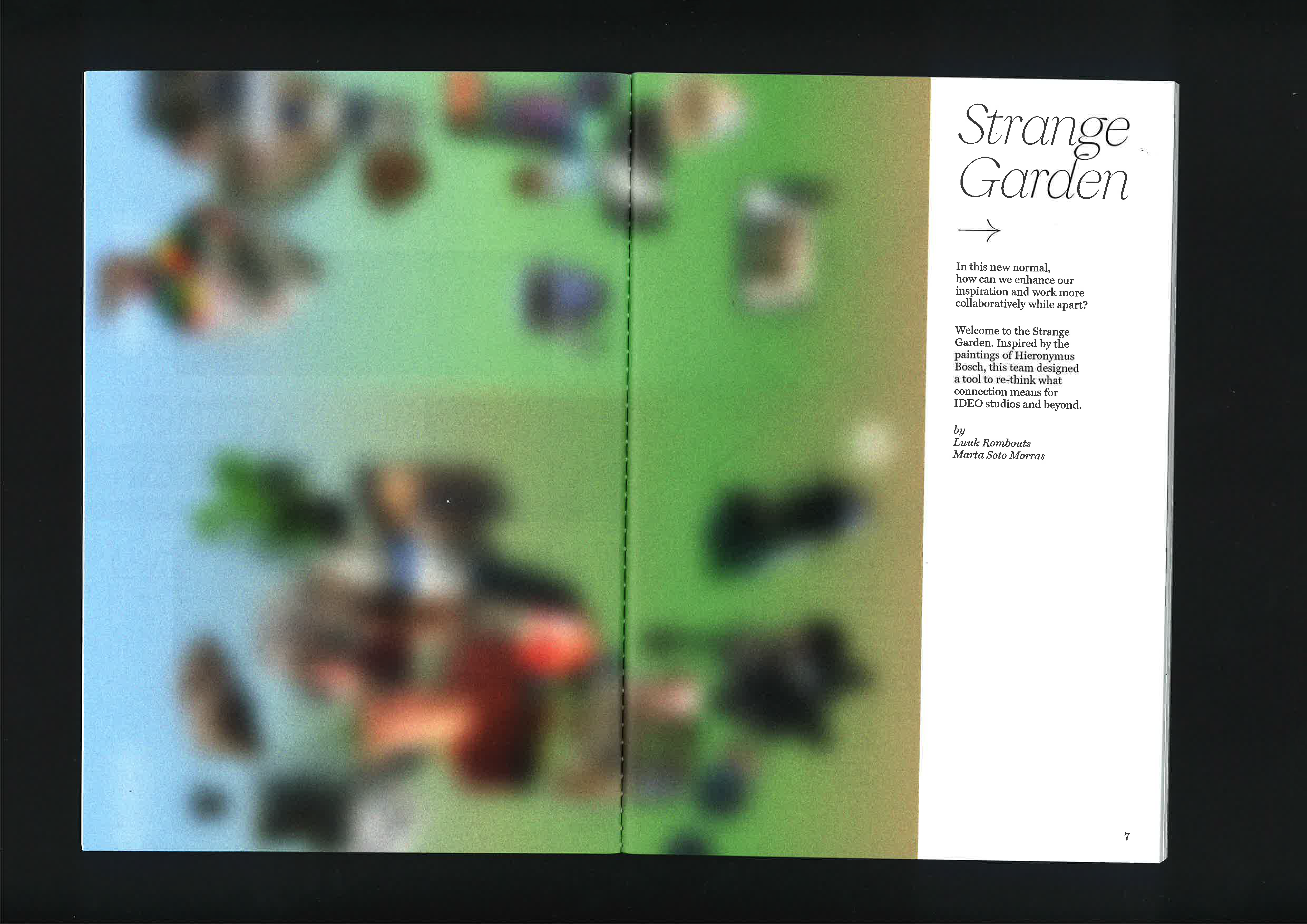
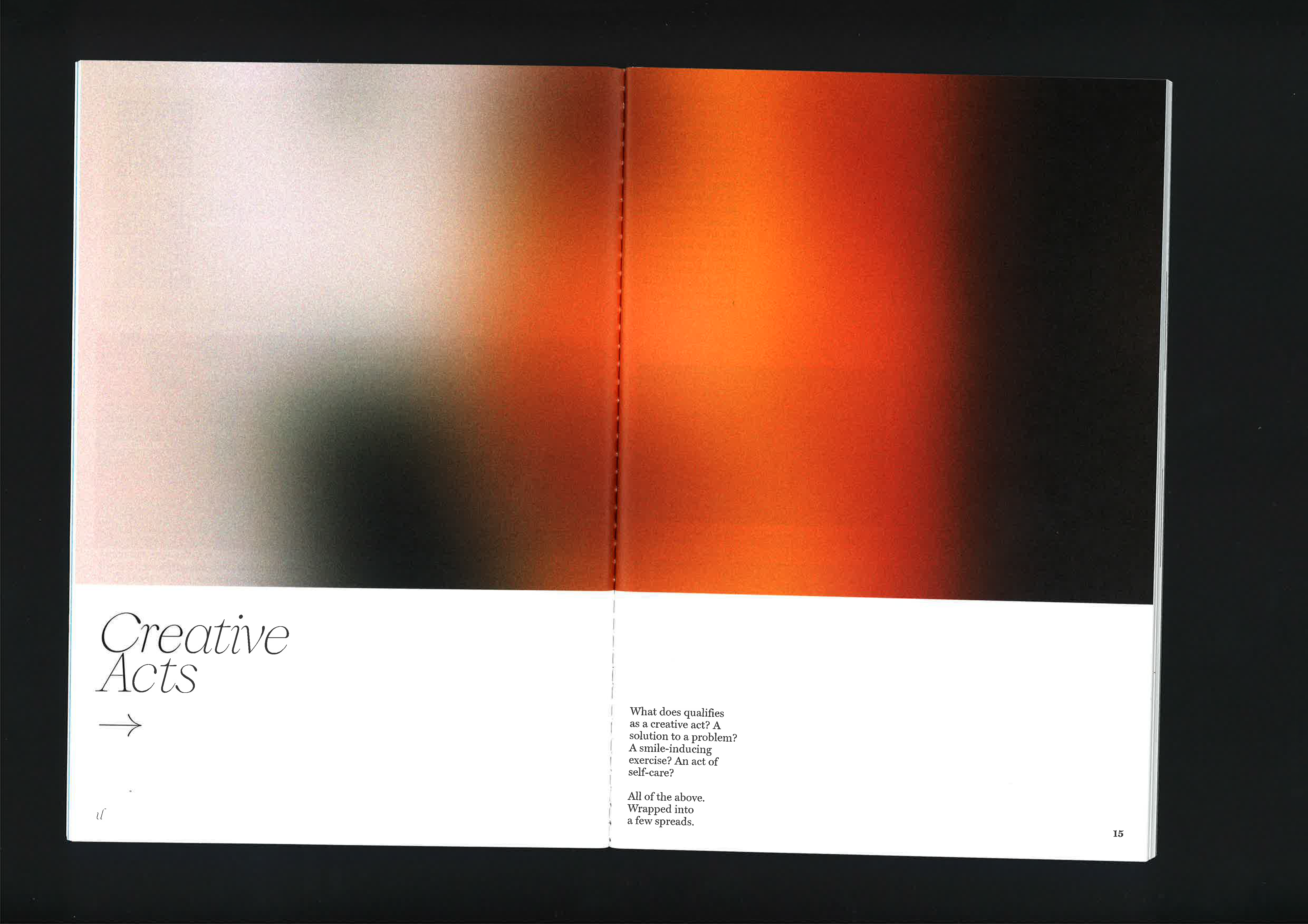
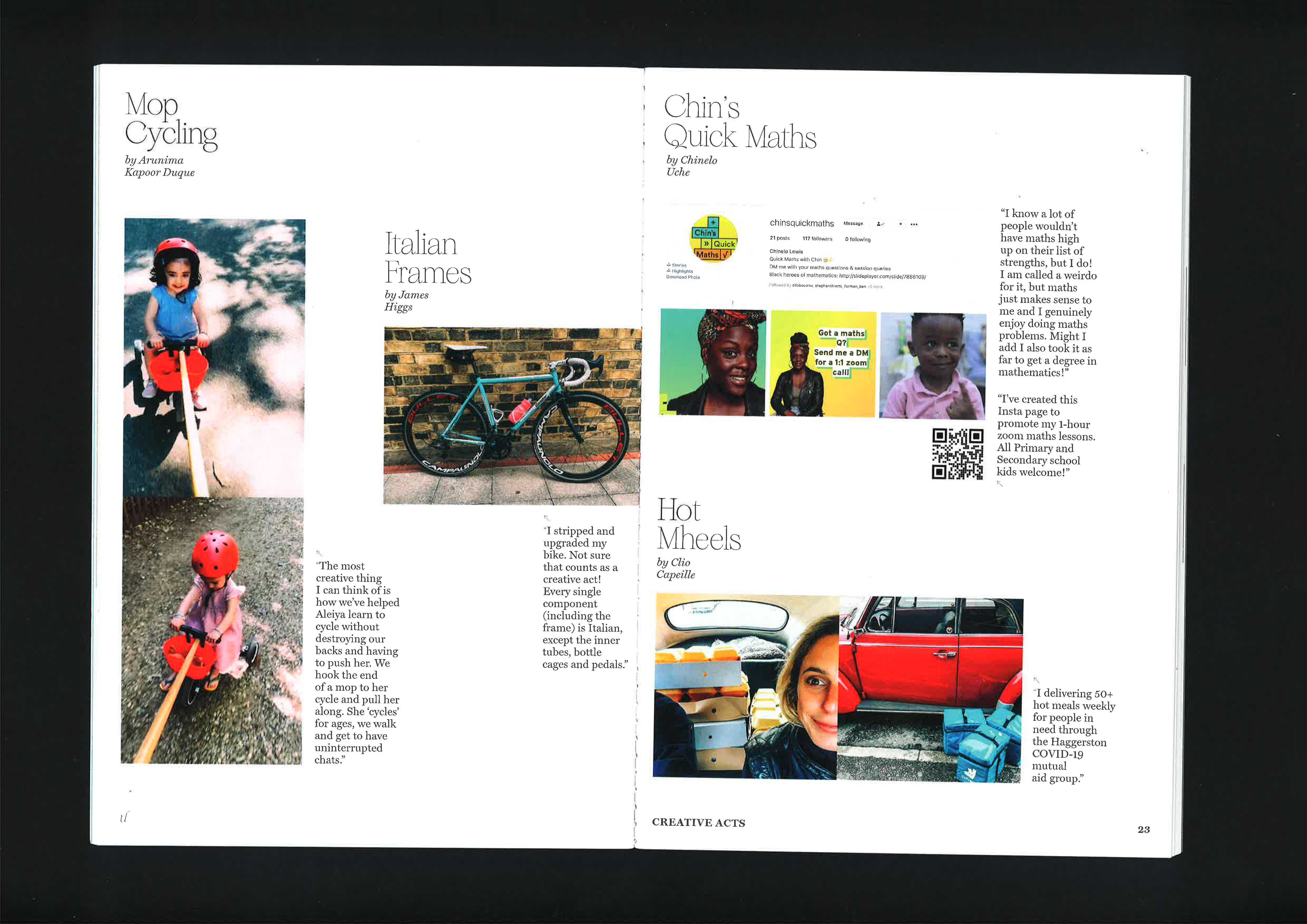
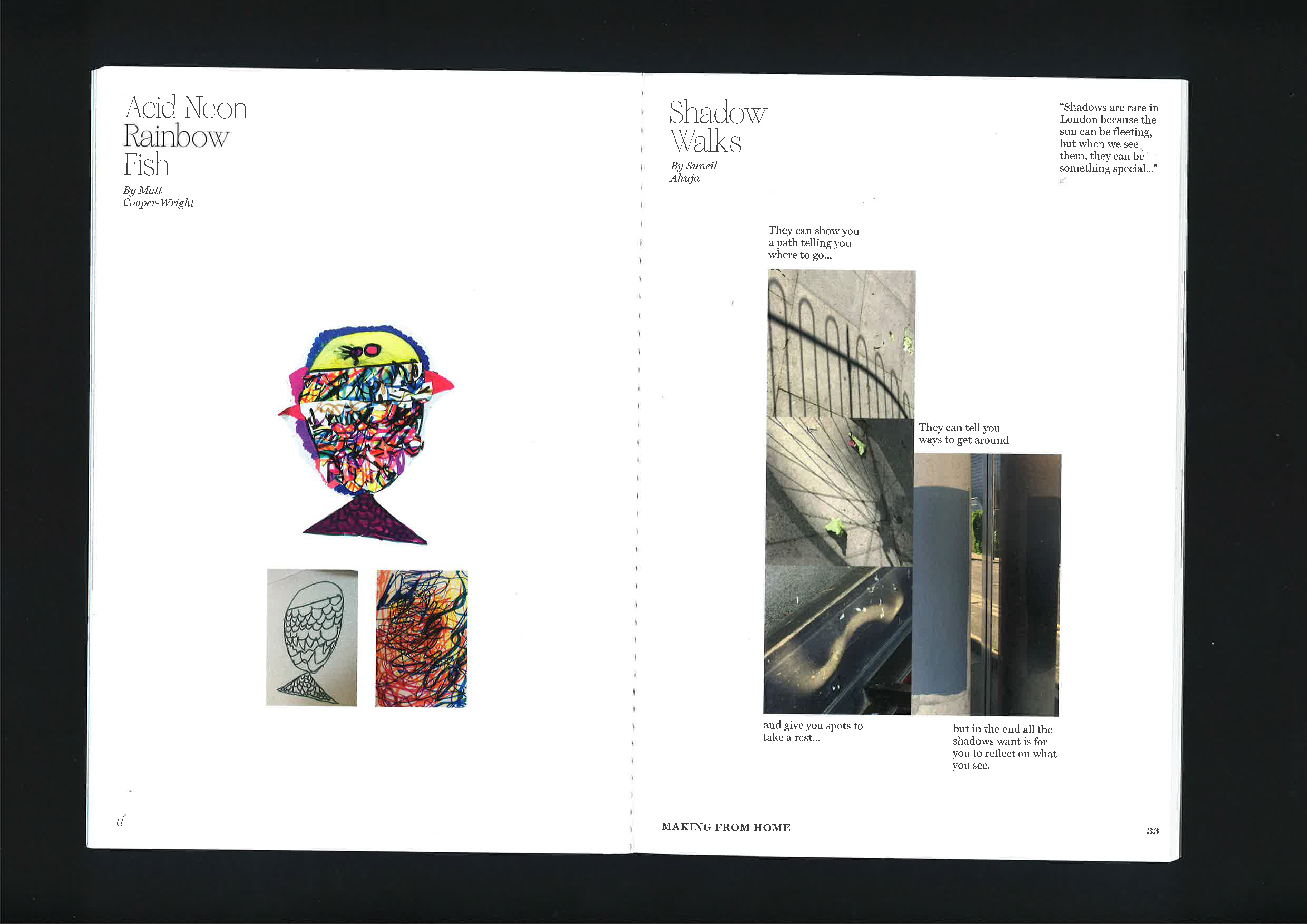
Unlocked is a collection of creative acts from the IDEO London community. The sparks that were ignited during lockdown. When times are tough we, as a studio, needed motivation and inspiration, ‘Unlocked’ intended to do both.
On the following pages you’ll find side projects, experiments in crafting, making, playing – many forms of collective creativity. Hopeful to inspire more, in the forever-changed post-pandemic routines ahead of us.
②
THE DESIGN PROCESSWhen tasked with designing this magazine during California's historic wildfire season, witnessing 4% of the state burning, I felt a deep call to make it as environmentally friendly as possible.
Despite facing logistical challenges in sourcing fully circular materials, I utilized 100% recycled paper and sought out ink alternatives like those produced from air pollution by companies like AIR INK and Algae Inks.
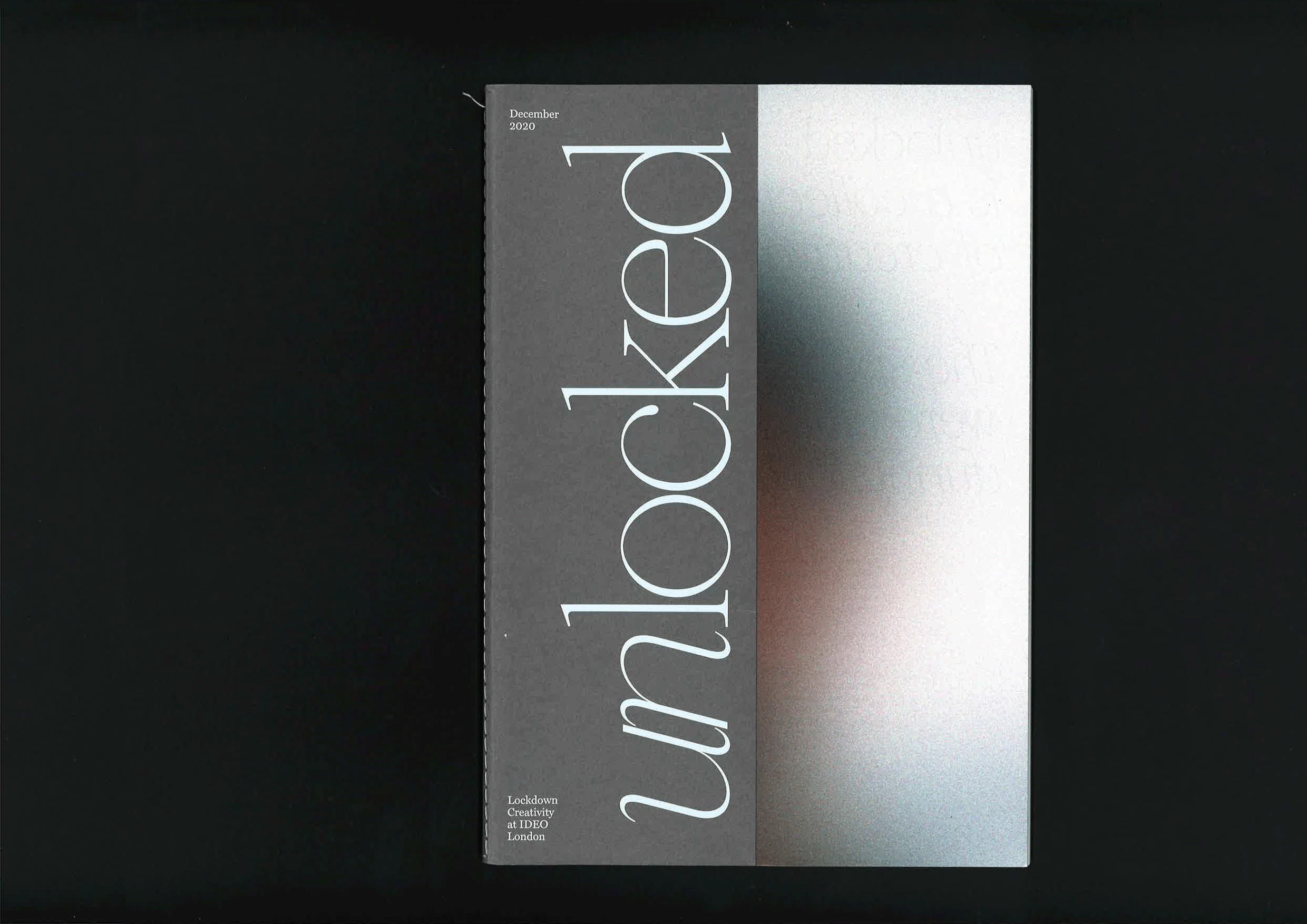
Though unable to achieve a fully circular product due to barriers in the industry, I minimized environmental impact by using a recycled paper made of coffee cups (GF Smith Extract), opting for reduced-ink design choices, including non-full bleed color and a serif typeface known for its ink-saving properties.
Serifs use 30% less ink than sans serif!
The chosen typeface, from independent foundry Boulevard Lab, reflects both classic serif style and a nod to 90s culture. The magazine's aesthetic, embodied by the cover's half-hidden design, symbolizes the blurred experiences of the pandemic, just as behind a steamed glass window, highlighting the beauty and creativity that emerged during lockdowns.