Ko Kombucha
Led workshops to shape brand strategy and crafted a playful identity for an organic fermented tea business, capturing its artistic essence.

①
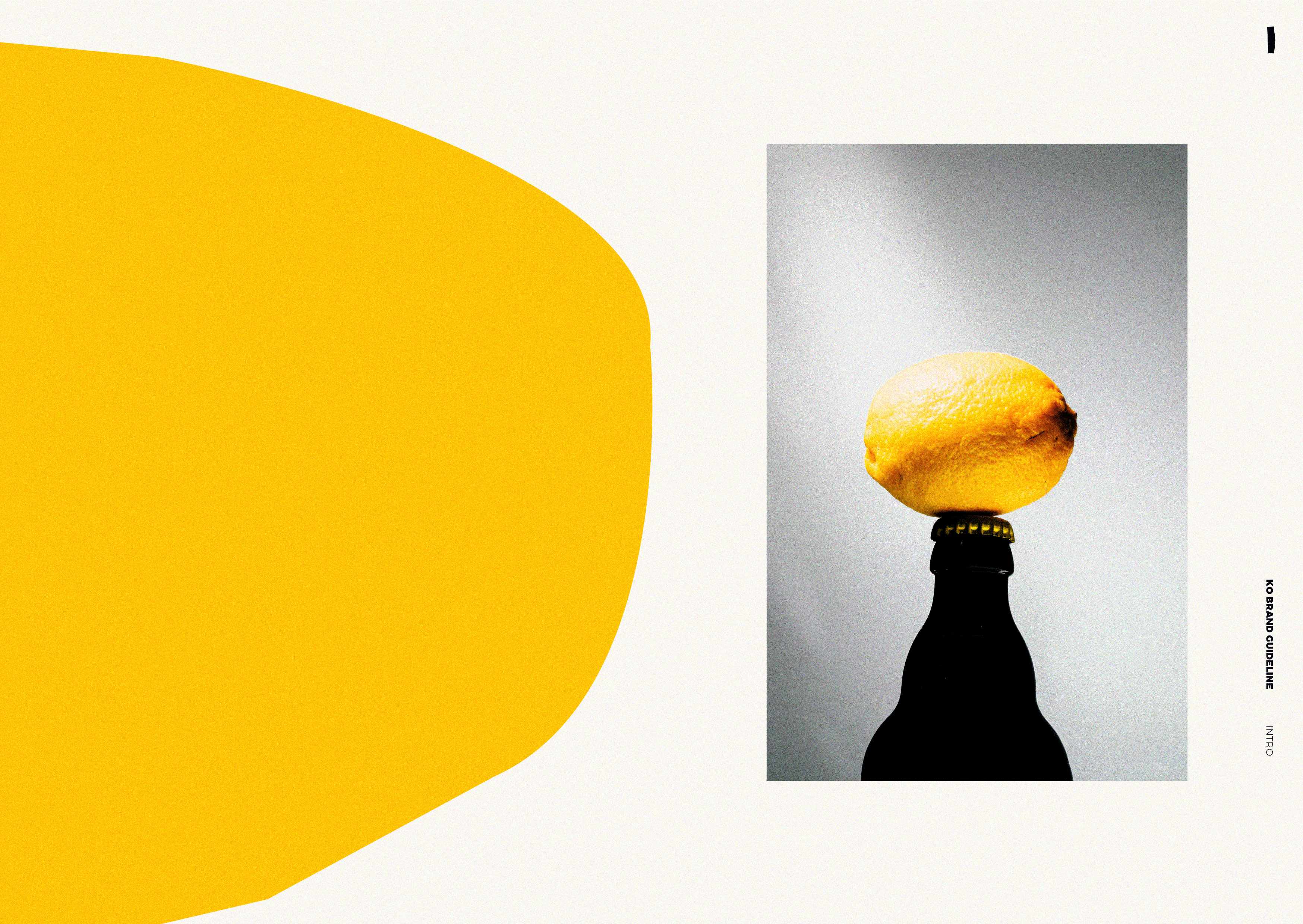
THE CHALLENGE“We need a brand to help us tell our story, with no frills, and a touch of humour”
At the time of launch, the global kombucha market size was valued at USD 2.64 billion in 2021 with a projected CAGR of 15.6% through 2030.
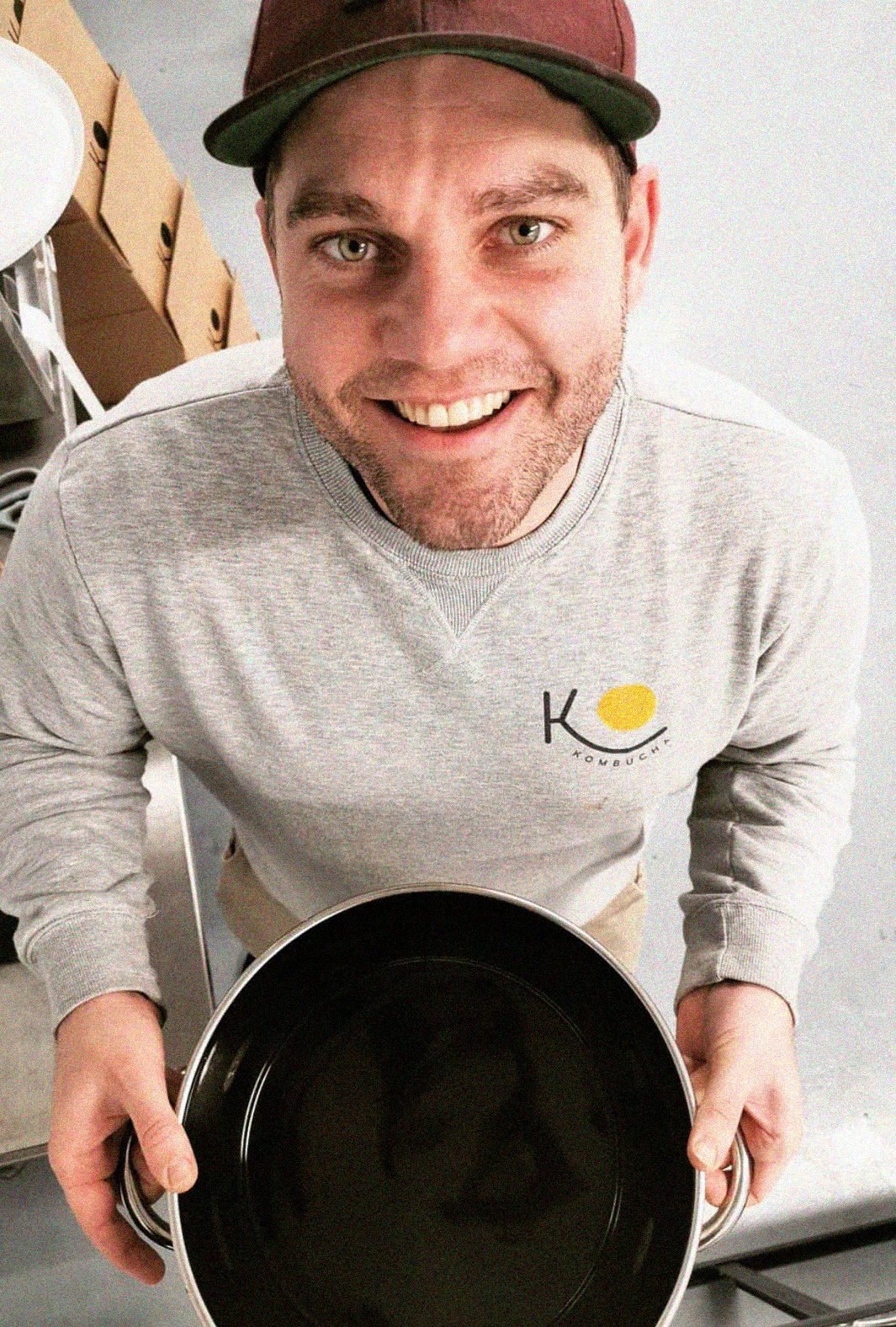
The company was founded by a Sotheby's art handler and a magazine’s marketeer. In the aftermath of Brexit, the founders moved from London to rural Ireland. They converted their spare bedroom into a micro-brewery, learning about the fermented drinks market and the science behind kombucha, until they became certified brewers.
The product is craft-brewed, produced in small batches with a handful of local, seasonal ingredients. Their unusual, yet successful business model pivoted them to scale to a commercial unit within only 7 months of selling their first bottle. By year three, with only pre-seed funding, and a team of four, Ko was stocked and enjoyed across 200+ health food stores, cafes and restaurants across Ireland.


②
THE OUTPUTThe client wanted a brand strategy and identity to reflect their tongue and cheek personality, their artistic sensibility, and crafty approach to the business.
So I designed a series of workshops to unearth the brand idea, having them cut out shapes, like the infamous Matisse project, which led to the foundation of the identity and subsequent collaborative approach.
I then designed the brand strategy and identity including mission and values tied to customer needs and the company’s ways of working. I led workshops to define the user experience, and routinely planned brand touchpoints by point of sale, packaging, print materials and social media campaigns.
Owned the art direction and photography, alongside logo, type, palette, illustration and key messaging.


③
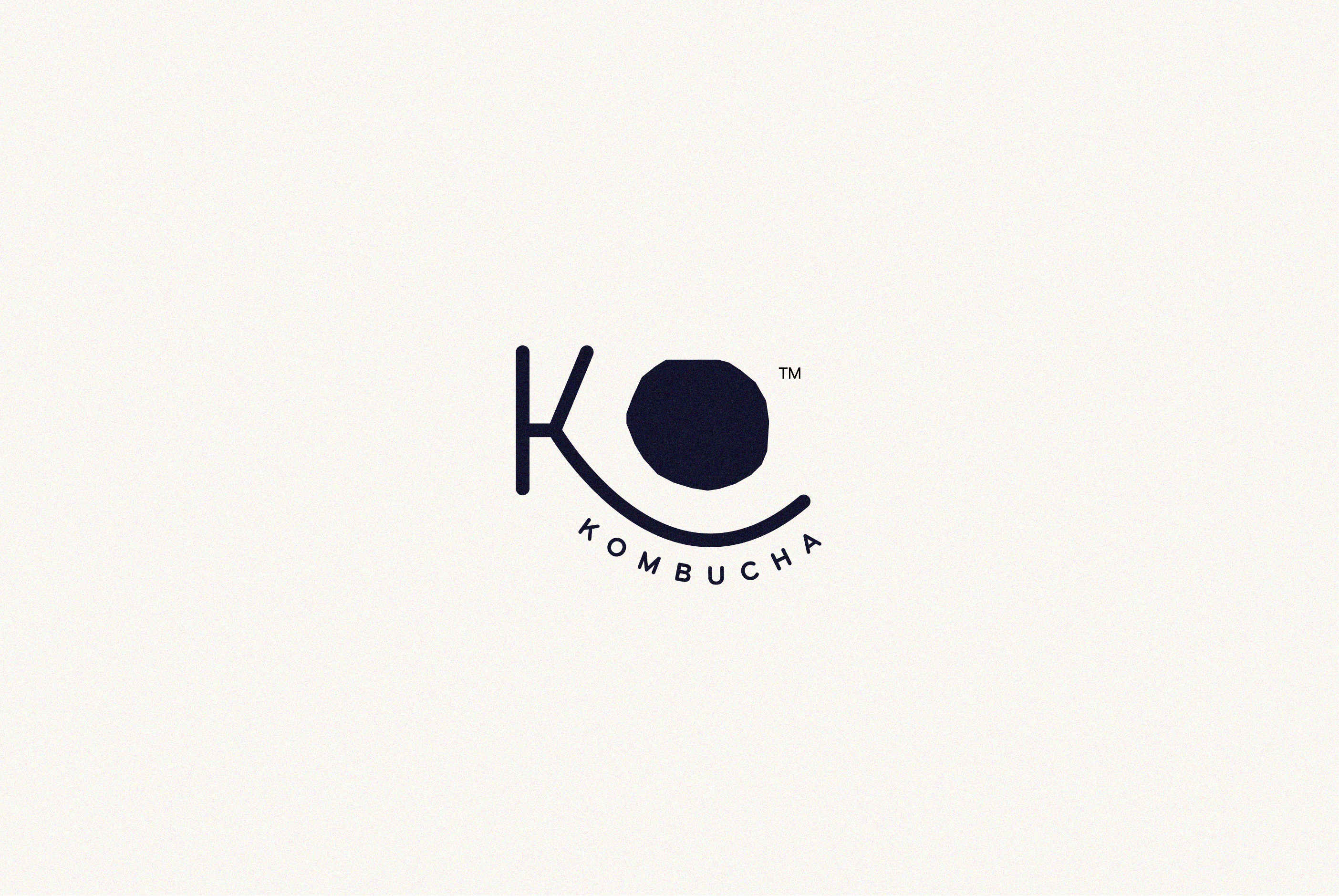
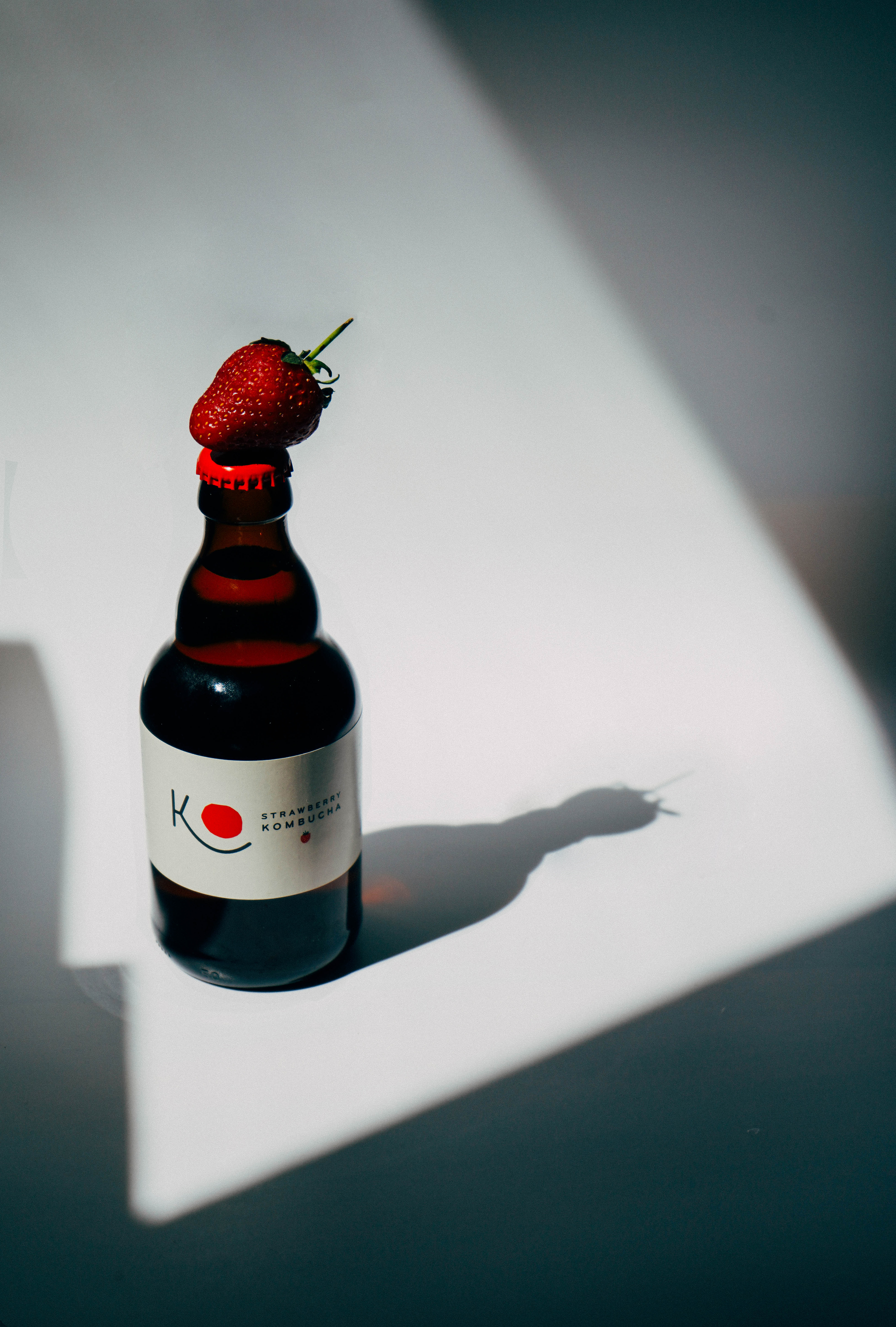
THE BRAND IDEA“The Beaming SCOBY”
KO Kombucha is a Live Active Culture made by hand using filtered water, Organic Teas, Raw Organic Sugar and a S.C.O.B.Y. (Symbiotic Culture of Bacteria and Yeast).
The mark figures an abstract S.C.O.B.Y. floating within the fermentation tank This draws a direct association between the core of the product and the brand DNA.
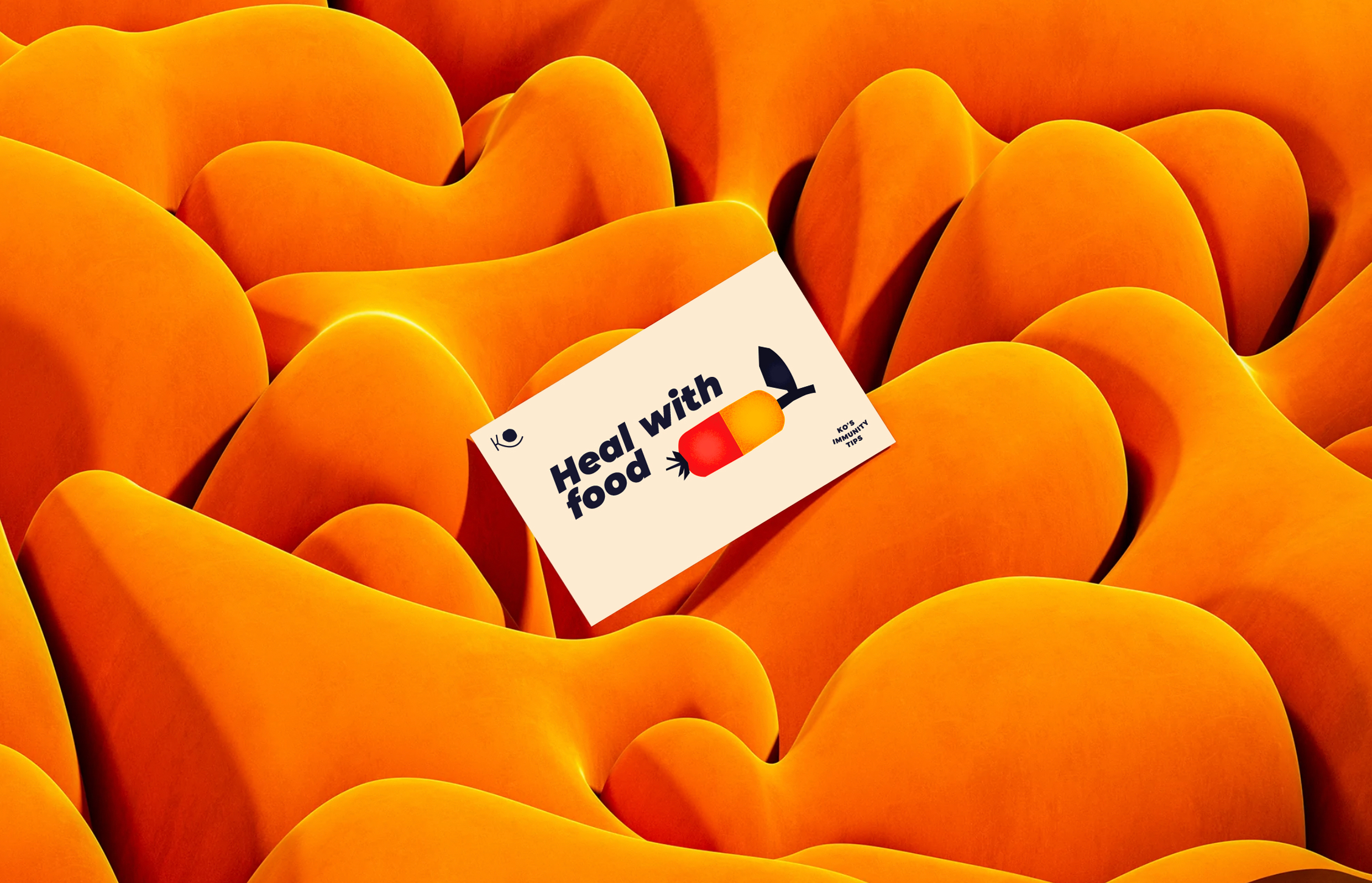
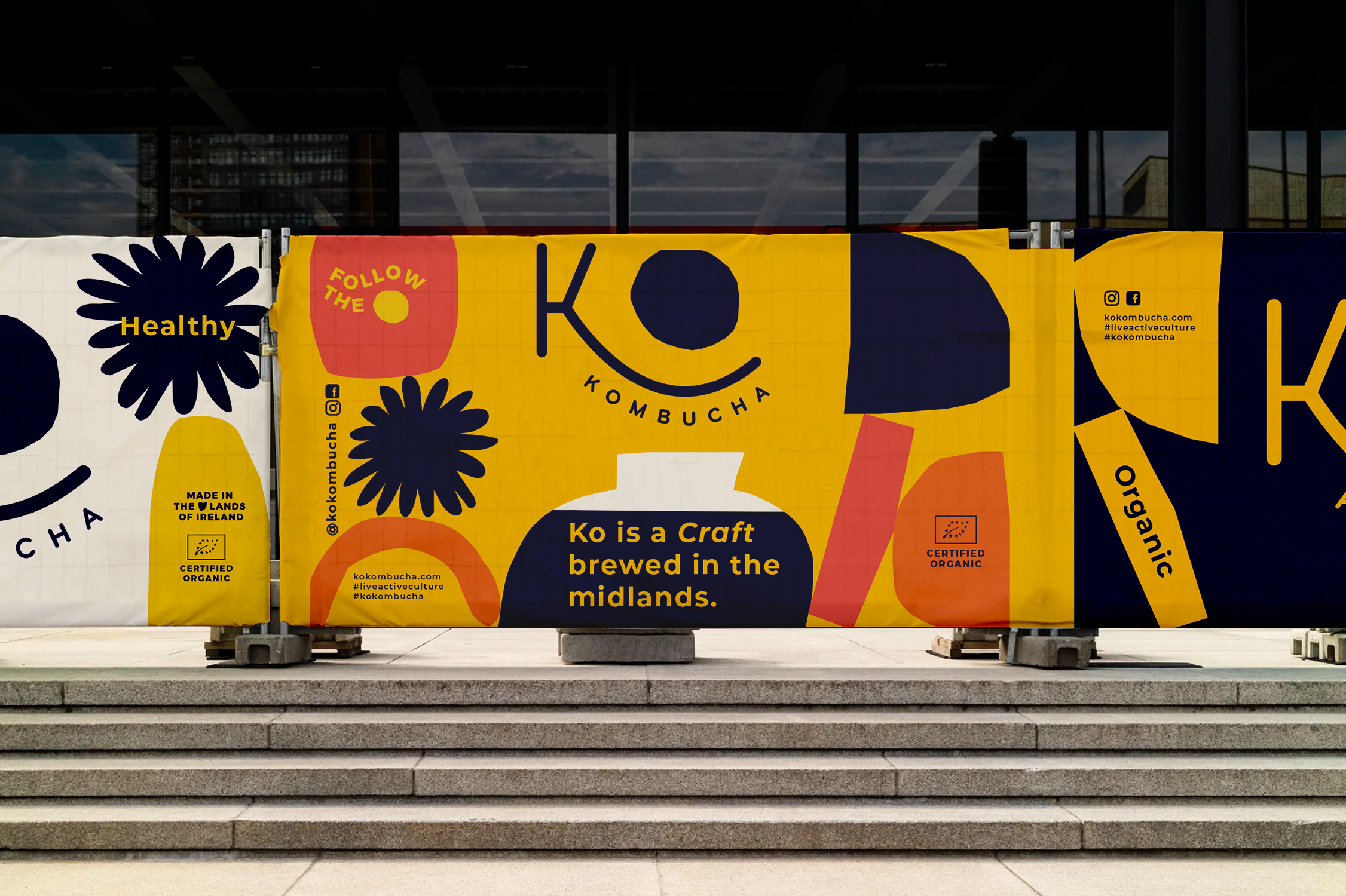
Gut health education is at the core of Ko’s mission. Through their product, they promote a healthier diet, a slower, more mindful take on the industry, and a hyperlocal approach to production.
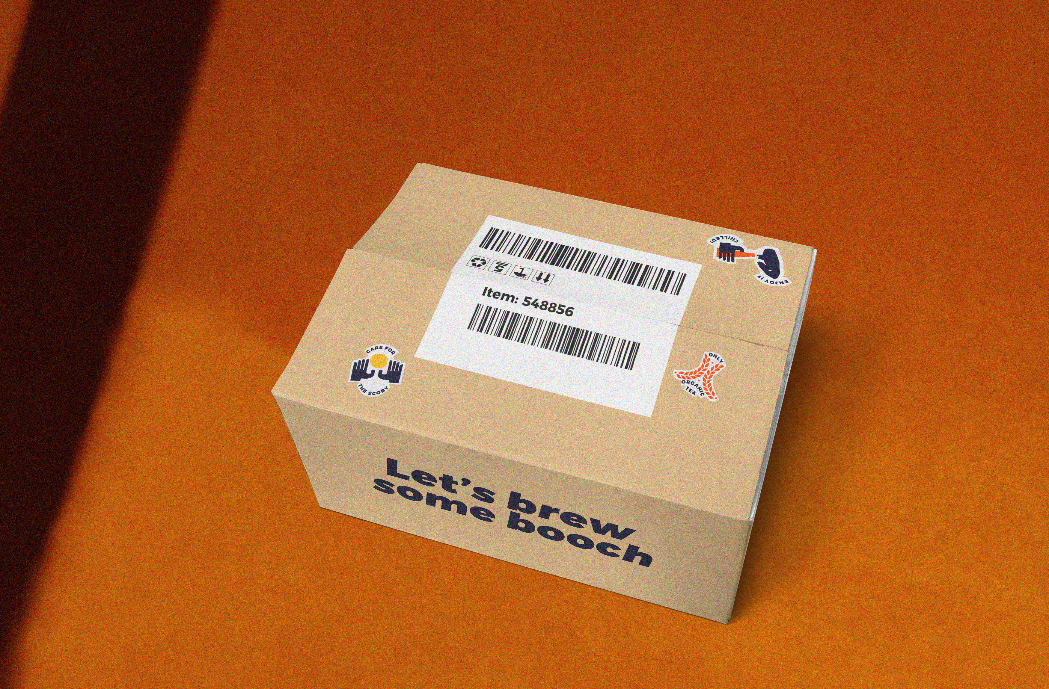
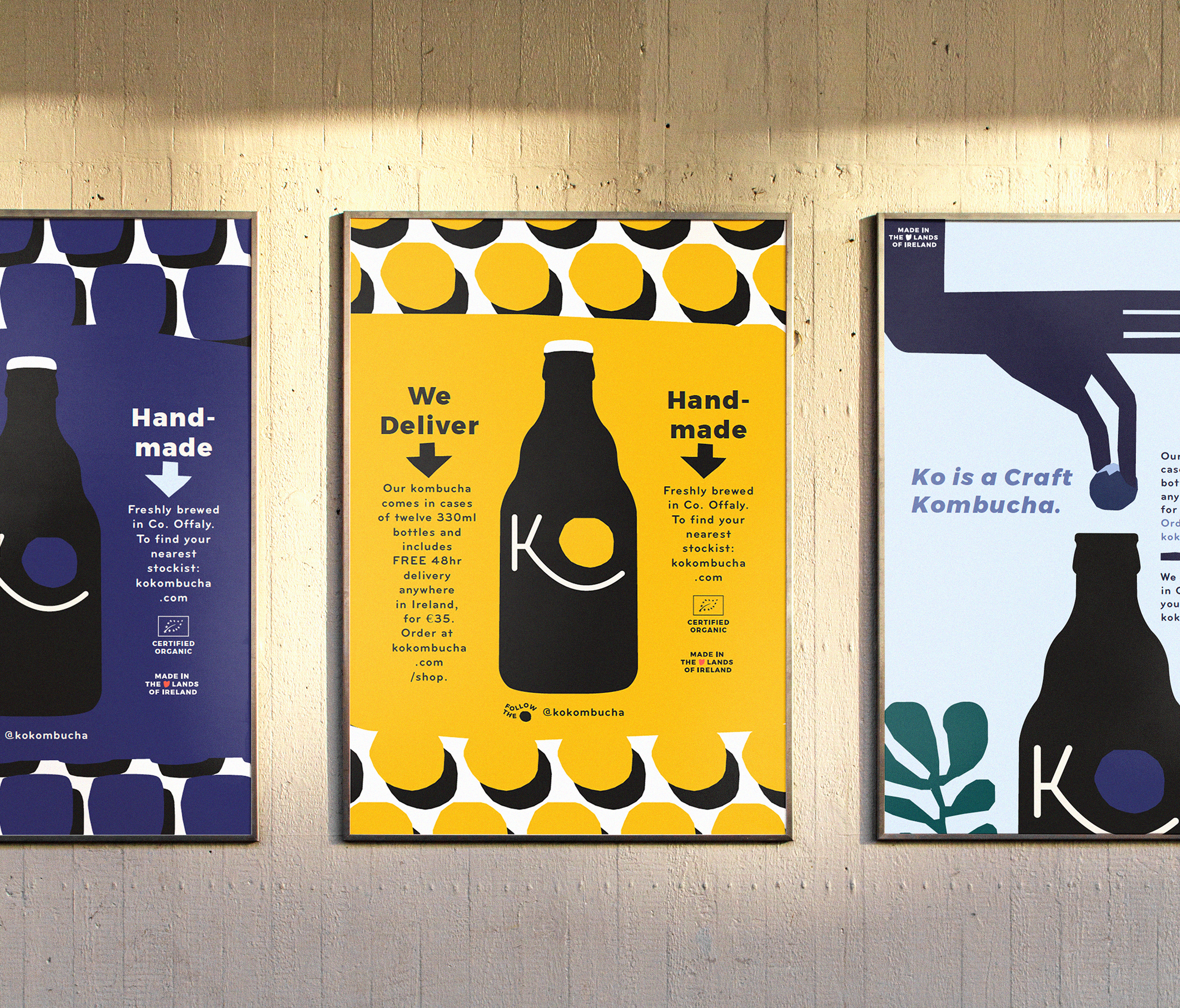
The brand intends to speak plainly, and playfully to their core audience, standing out by being bold, graphic and colorful throughout all applications.
④
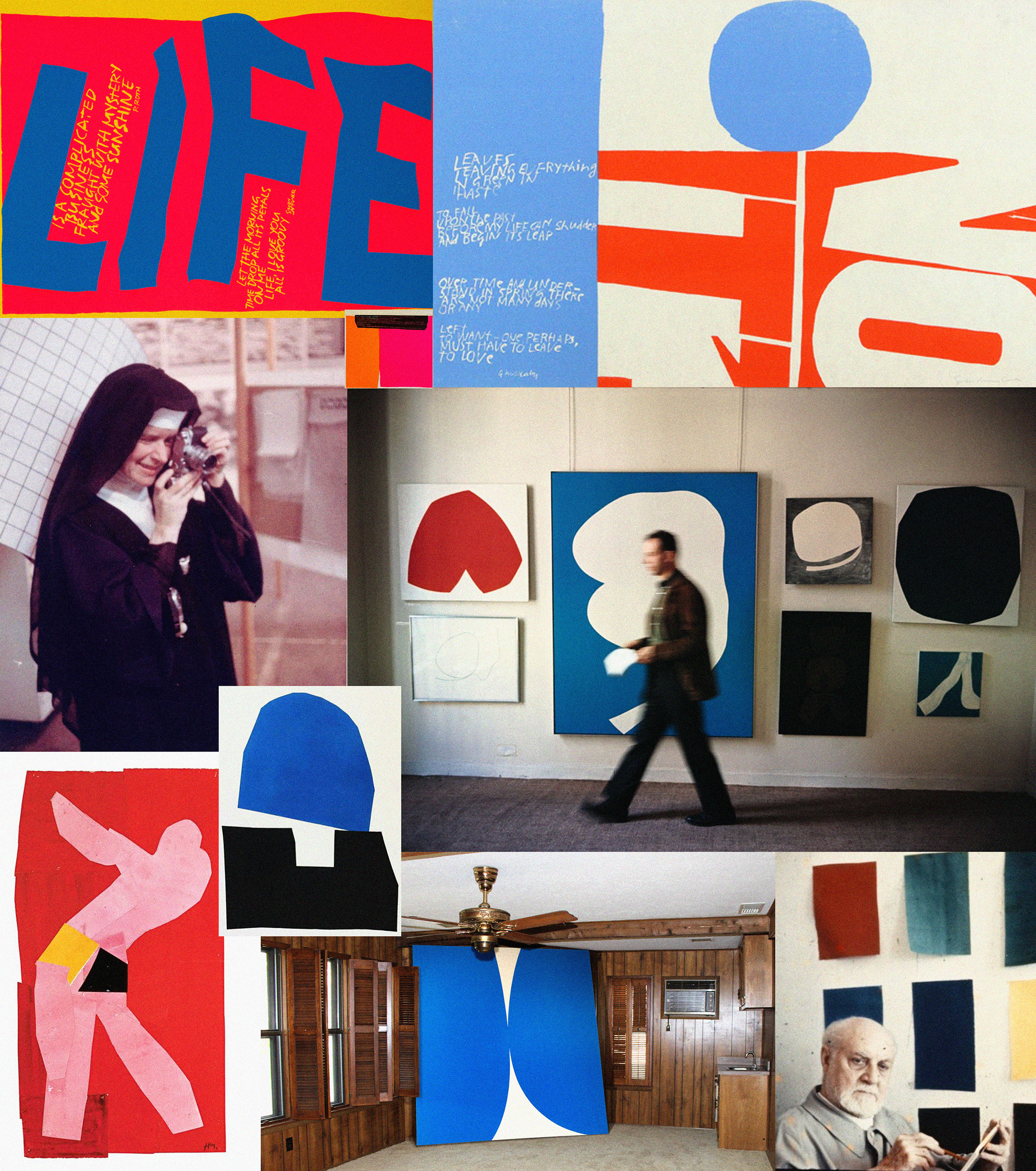
CULTURAL REFERENCESThe cultural references at the heart of our brand dna:
which is built around Playfulness and Color.
Corita Kent, an artist and nun practicing vibrant Serigraphy Art in 1960’s California. Her simple, bold and colorful medium and messaging heavily inspired our brand’s tone of voice.
Matisse’s 1940s radical cut-out series inspired us for both form and process.The painted and cut-out paper sheets arranged into lively compositions, are striking for their play with color and contrast, their exploitation of decorative strategies, and their economy of means. Just like Ko’s simple fermentation process, expressed by simple, replicable steps, yet striking nuances of flavour, given by the handmade production approach.
Ellsworth Kelly’s 1950’s work is centered around an abstract vocabulary of line, form, and color, investigating how figure and ground are perceived in nonrepresentational painting. We’ve used this Gestalt principle in our brand communications, through large decal colorful printing.